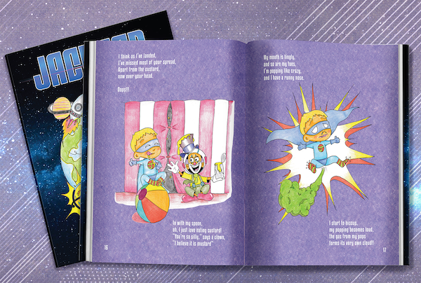
You know the mistake that every author, every speaker, every writer makes?
They assume everyone wants to read their work or listen to them speak.
Unless you’re George R R Martin, the chances of that are slim.
And George R R Martin too didn’t have that honor with his very first book when no one knew of him.
And that is key.
To make people want to read your book, you first need to make them read your book.
That’s when your perfect story will step into the limelight and do its job.
That’s when readers will fall in love with your book.
But first, we gotta make them read.
And for that, we need to understand what makes them not read.
Why People Stop Reading Books Half-Way
How many books have you in your life stopped reading after a few pages and forgotten it on the shelf forever?
Everyone does that.
But your book shouldn’t be added to the pile of books that we never finish.
We can’t let that happen.
Apart from the storytelling, there are simple things that our brain likes about a book – how it looks. And by that I don’t mean the cover, I mean the text.
This is called Typesetting. In simpler words, Layout.
The margins..
The font..
The text size…
All this makes your book presentable and more readable.
And in the best of books, these elements are carefully thought out.
You remember your school books, or even the academic reading that you are given in university? Why were they not fun to read? Look at this picture of a page from a book..does it look pleasing to the eye? Would you like to read the full text? Are you tempted to read it?
Me neither.
Now look at the book page below… that’s more like what you want.
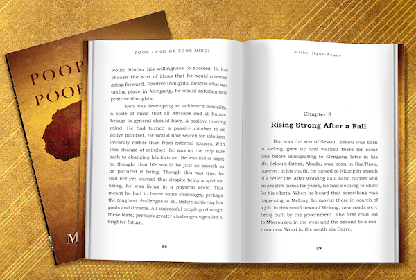
Typesetting doesn’t only make your book easy to read, but also brings finesse and elegance to your book.
That is what makes you a professional, makes you a brand.
Even though it might be your first book, you don’t want to be identified as an amateur.
5 tricks to make your book un-put-downable
1: Resist the temptation of fonts
Your typeface and the font are unarguably the most important element of typesetting. Font can do wonders to your book.
Starting from evoking the mood to setting the time period…
For example, Serif type gives a glimpse back to classic styling, craftsmanship and tradition, whereas sans serif type conveys modernism and simplicity. (‘Serif’ refers to small decorative flourishes at the ends of the letter strokes.)
While choosing a font, don’t go experimenting. Go for the classic ones, they are classic for a reason. Some font styles are naturally easier to read for our eyes.. like the example below.
Credit: https://webaim.org/techniques/fonts/
Your font can also be used to build your identity. Most authors usually stick to one font style throughout all their books. The more familiar your audience is with the font you choose, the more likely they are to trust you and the message that you’re trying to convey.
For example, check out the font in all the Harry Potter books.
Deviate too far from the norm and you risk alienating your audience.
2: It’s all about those margins
Margins work like a highlighter, it should feel like words are coming out of the book.
Margins help create a book block, whether you want to keep it really small or full packed, don’t forget the binding. Leave enough for it.
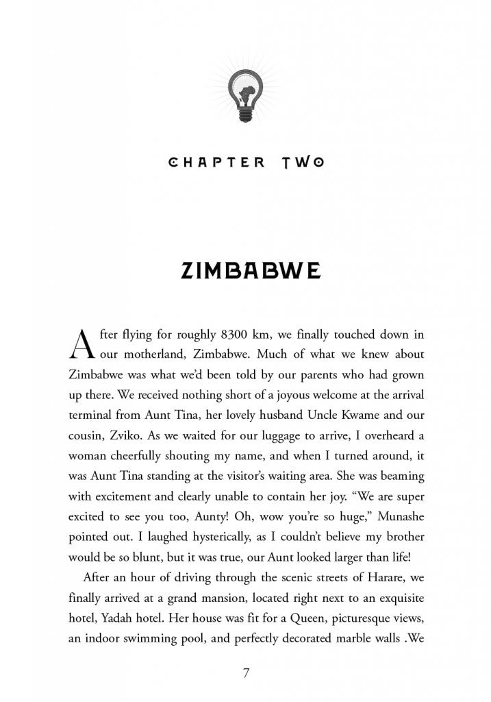
Your reader should be able to hold the book and see the text clearly without any distraction. The entire type block area should give a feeling of openness, making the book inviting to read…as some like to call the “negative space”.
https://www.whitemagicstudios.co.uk/catalogue
Observe the page layout and the use of negative space on this page,.. all that blank space draws your eyes towards the main text…
So, use that blank space…(by not using it).
3: Don’t leave bread crumbs, nobody will follow
Look at the ending of this page… This is a Widow..a paragraph started in the last line…(see image below)
These tiny details can put off your reader and make them leave your book, however interesting the plot might be.
And, the opposite also happens, the orphan… The first line of a paragraph shouldn’t fall on the last line of a page, and the last line of a paragraph should not go over to the top of the next page.
Widowed and orphaned lines make the reader pause, thus impeding reading comprehension.
4: Be cautious with art and images
If your book has illustrations and art, the page layout must be designed to give enough room for the art to do its magic.
Positioning of the images is an important step in laying the foundation for the genre of the book…
If you’re writing a book for our little friends, the very small amount of text per page will go right on top of the art.

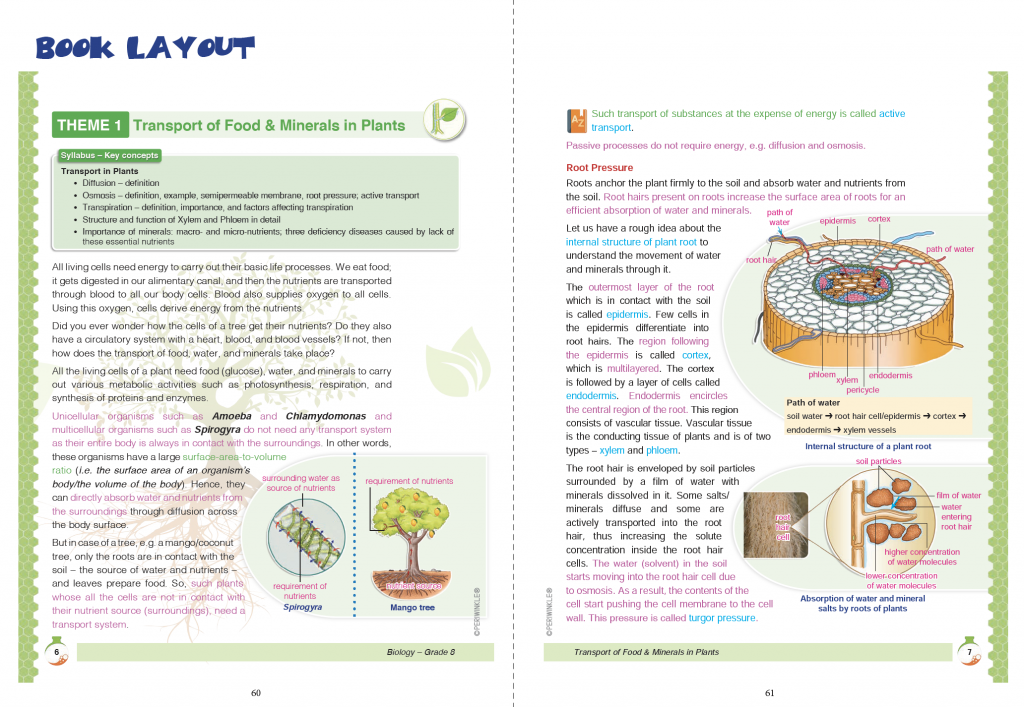
When it comes to school textbooks, they have a bad reputation. They are no fun!
Well, that can also be changed.. they can be made fun and easy to read…
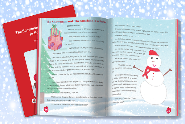
Even the dreaded science textbook…
5: Devil is in the details
Small details can make your reader uncomfortable while reading the book.
Don’t forget – Typesetting is a design trick that few people notice unless it’s done poorly.
Ambiguity in text impacts reading speed and understanding..
Have a look… The C’s and O’s look alike,, you don’t want your reader to lose their “oool”
Or feel, “cod”. Why cod?
Letter spacing improves readability by providing greater separation and clarity between adjacent characters and words. When letters or words appear very close to each other, there is more room for confusion.
Resist the temptation to cram as many elements as possible onto a single page — it won’t look dynamic, it’ll just look busy. Remember that white space is your friend.
You want the readers… to get a sense of progress…with every page they turn..
Looks Do Matter
Because it invites the reader to read and makes them stay.
Which is why, get professional help to format your book, or typeset your book, in a beautiful layout that is easy on the eyes and that will make it easier for your readers to read your book.For further advice, please connect with White Magic Studios. We help authors and publishers typeset manuscripts from every genre of books, keeping in mind their audience and culture.

